How Smoothly Works
Simplifying heathy eating

Make your own smoothie
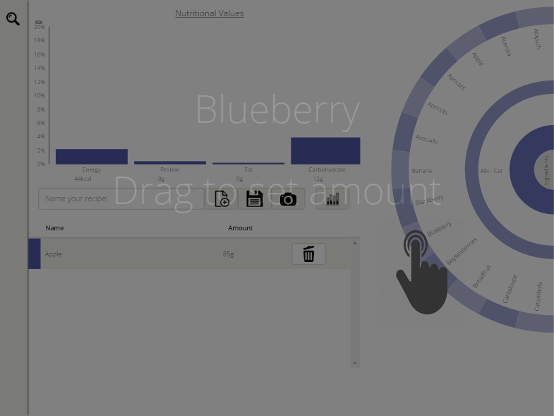
Use the sunburst to choose ingredients. Tap on the five different categories; fruits, liquids, nuts and seeds, herbs and spices, vegetables. Touch and hold on a specific ingredient and then drag to the left to set the amount of it. Did you change your mind about the amount? Don’t worry you can change it in the table by touching the amount of the ingredient and then drag left or right to decrease or increase respectively. Name your smoothie, upload a picture of it and save it.

Use the already saved recipes
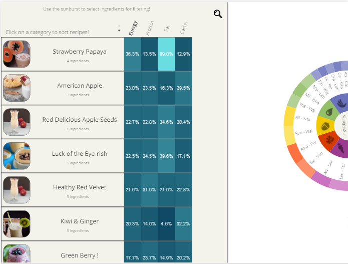
Tap on the search icon to see the already save recipes. In that step, you can choose ingredients in the sunburst to filter the recipes and see the recipes that only contain it. Tap on a nutrition category to order the recipes based on that nutrition. The brighter the color of the box the bigger the percentage.

Benefit from your personal RDI
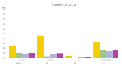
In the start page, enter your gender, age, weight, height and intensity of daily exercise in order to use your daily recommended intake of nutrition. Compare ingredients in the bar chart and see how healthy is a smoothie for you, and how much it fulfills your daily needs in energy, protein, fat and carbonates.
About
Smoothly. Your online smoothy maker
Smoothly is a student project under the course Information Visualization of KTH, Stockholm. Our goal with this project is to make an application for touch based interaction devices that can help you achieve a healthy diet.
Why?
It is very important for people to know if they actually eat healthy and what nutritional values their food contains. The information is available but it’s hard for a person to do the calculations and personalize all this information according to his or her needs. Our attempt is to make an easy way of finding, comparing, and combining ingredients into personalized recipes. Cooking is great fun and being healthy and aware of what you eat should not make it complicated and less fun!
Why smoothies?
Smoothies have become very popular in the last decade. It is a fast and easy way to consume large serving of fruits and vegetables. It is a tasty hack for a healthy diet. Besides that, by choosing smoothies we could focus both design and functionality to a specific user and task. However, the project can easily be expanded and use any data with some kind of hierarchy.
Why touch based interaction devices?
We decided on that based on the concept that a user would like to use this application while he is in the kitchen, ready to prepare a smoothie with ingredients that he or she probably already have. Using mouse or keyboard when you cook will only make all this process more complicated. The user can interact with our project easily and fast since he or she is only a few touches away from completing a task at all times.
Process
We divided the workload based on what each team member could do best. Some people focused on coding when others on gathering the data or making the graphic profile of the project. The meetings were frequent and efficient. The feedback from our professor and our colleagues was always under consideration when we had to make decisions.
Technologies
The data were stored in Firebase. D3 library, HTML, and CSS were used to build the application and the website. We host the code on GitHub.
Overall, we learnt that a lot of things need to be considered when creating an application that visualizes data. There is a lot of competition on the food recipe sites market and we had to make our application unique so it can stand out. We had to think of specific tasks and target groups. In that way we focused on a design and we sorted out the data that were preliminary a lot to be visualized. Also, the visualization itself is not enough, we had to tailor the data to the user and make the interaction with the visualizations intuitive and effortless. Another thing that we learned is that we have to efficiently use the space that a touch device screen is offering and use the most of what the colors of visualizations can offer.
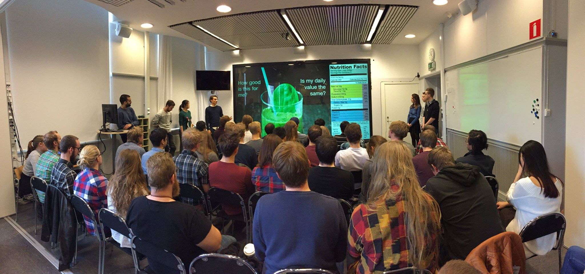
The project was presented in VIC Studio at KTH on Friday, 18th of March 2016.


